Introduction
The Product
The University of the Fraser Valley, situated in British Columbia, Canada, is a fully accredited public institution. The university provides a comprehensive array of programs including degrees, certificates, diplomas, and adult basic education. Its competitive edge lies in its affordable yet specialized courses spanning both academic and trade domains.
The Problem
The absence of a concise and readily accessible program cost breakdown for international and domestic students before enrollment, combined with a poorly structured information architecture.
The Goal
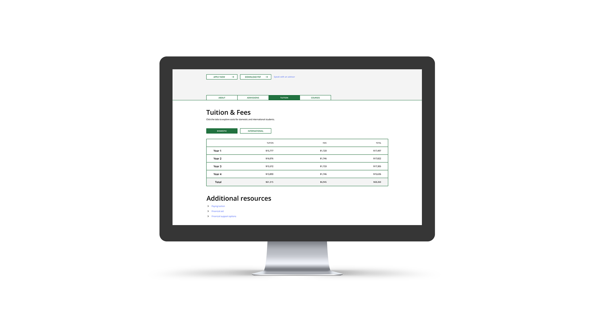
The goal is to enhance user experience in course search and application through streamlined navigation. Additionally, integrate a cost breakdown to offer transparent program pricing. This project involves overhauling UFV website's Information Architecture (IA) and creating an interactive hi-fi prototype. The redesign aligns with user needs, school objectives, and brand values.
My Role
Solo Lead UI / UX Designer from conception to delivery
Responsibilities
Conducting interviews and research, creating paper and digital wireframes, prototyping at both low and high fidelity, conducting usability studies, accounting for accessibility considerations, sourcing images & creating copy and iconography, and continuously iterating on designs.
Understanding the user
Summary
The primary user demographic for domestic university students is predominantly female, accounting for approximately 60% of the total. The age range among domestic students ranges from 17 to 75, while often juggling work commitments alongside their classes.
Roughly 30% of the student body comprises international students. The gender distribution in this group is closer to a 50/50 ratio of male and female students. Predominantly, these international students come from India (40%), followed by China (12%), and other nations including Vietnam, Korea, and Japan.
Considering that these users frequently interact with both the web and mobile versions of the university's website, I recognized the importance of optimizing webpages for adaptability, ensuring seamless scaling and resizing across different devices.
Pain points
Scheduling Conflicts - Students aimed to prevent class schedule clashes.
Information Clutter - UFV's original site overcrowded with irrelevant data, crucial details buried.
Easy access to advisors - Students wanted a simple way to connect with advisors and guides during applications.
Clear Costs - Both international and domestic students wanted a clear easy breakdown of the costs of programs before they enrolled.
Problem Statement
Emily is a new domestic undergraduate student who needs an easy way to find courses and speak to advisors because she is unsure of the course selection process
User Journey
Mapping Emily's journey revealed how helpful it would be for a clean simplified IA for new domestic and international students.
Starting the design
Content Audit & Flow Mapping
I compared dozens of websites, including UFV's direct competitors, analyzing their unique information architecture. I documented popular categories and noted UFV-specific sections. This process informed the creation of a comprehensive sitemap, aimed at enhancing UFV's structure for improved clarity while retaining user-friendliness. I then made sitemaps for both a generic "average university website" and a personalized "UFV-tailored website," fostering familiarity and setting a universal standard for user-friendly course searching.
Card Sorting
After making each category and subcategory, I ran a card sorting exercise with users to organize which sections were main categories, and which were subcategories, as well as where they grouped each card.
Results & Findings
An in-depth analysis of the card sorting exercise and a thorough comparison with my initial flow map revealed diverse user perspectives based on age, education level, and location. By adjusting my flow map based on these insights, I aimed to create a coherent and user-oriented navigation experience.
1. Those with university education background followed a more traditional arrangement, unlike high school graduates. This highlighted the importance of catering to different educational backgrounds for a seamless experience.
2. User preferences, not hierarchy, drove the organization of categories. Users structured sections according to personal utility rather than perceived importance, emphasizing the need for practical alignment over a rigid hierarchy.
3. Age played a significant role in navigation behaviours. Younger users exhibited tech-savviness, exploring multiple paths, while older users preferred straightforward routes for ease of use.
Sitemap after card sorting exercise
Paper Wireframes
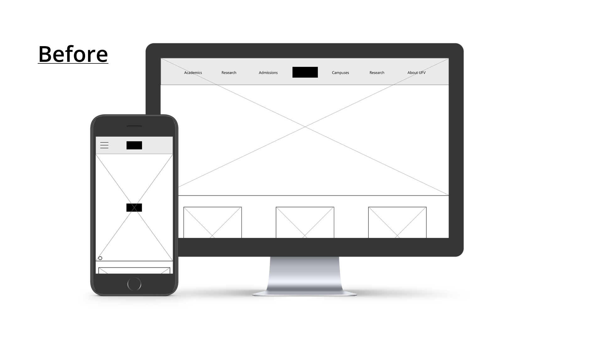
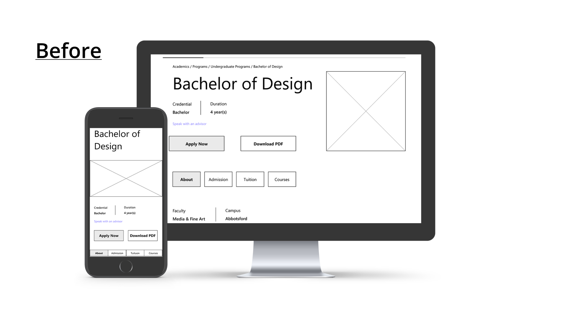
Through multiple paper wireframe iterations, I ensured that the digital wireframes addressed the user pain points effectively. The new screens prioritized a streamlined and organized IA, and a decluttered homepage.
Digital Wireframes
A user-centric wireframe that enhances navigation alignment and engagement for UFV's website.
The initial wireframes were designed with a focus on accessibility, ensuring font sizes suited both mobile and web platforms. This approach led to a smooth user interface and played a role in refining the Information Architecture for enhanced clarity and conciseness.
Low fidelity Prototypes
I connected the prototype screens and used them to run usability studies. I kept in mind both the flowmaps I had compiled as well as the initial goal of making the website more concise with easy access to information
Usability Study Findings
I conducted two usability studies, with the findings from the first study guiding the transition from wireframes to mockups. the second study, using a high-fidelity prototype, identified areas in the mockup that needed refinement
Round 1 findings: the first usability study highlighted difficulty with the search navigation and drop down menu.
Round 2 findings: Inconsistencies in element sizes between mobile and webpage, more space needed
Refining the design
Mockups
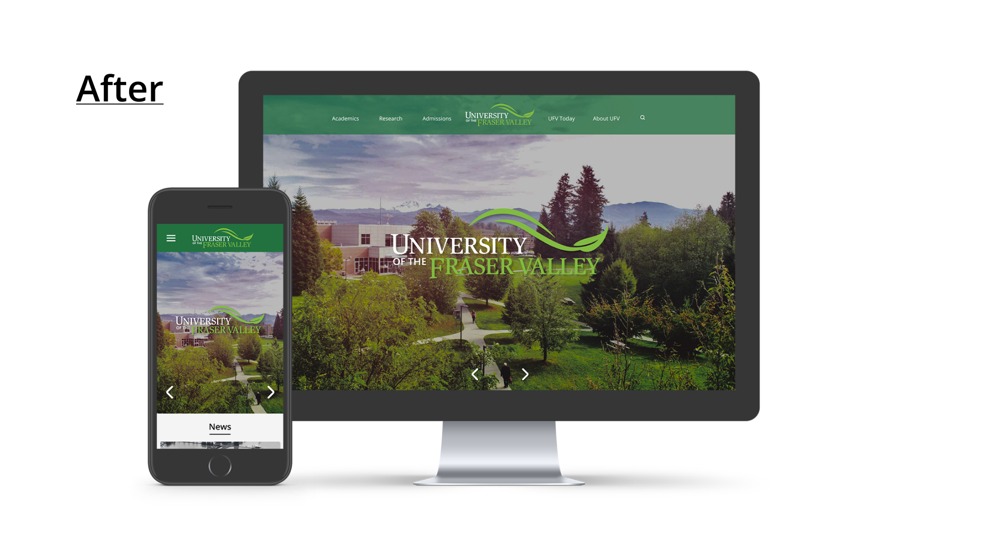
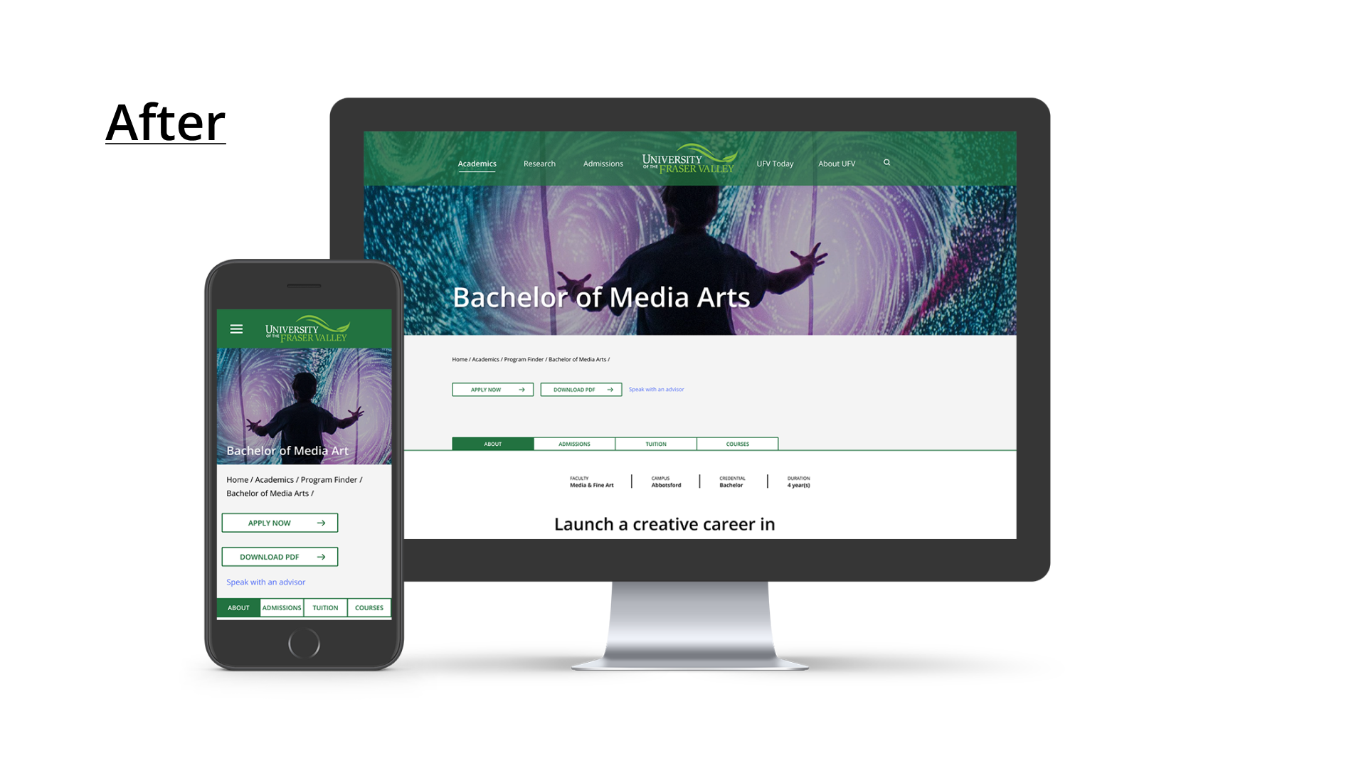
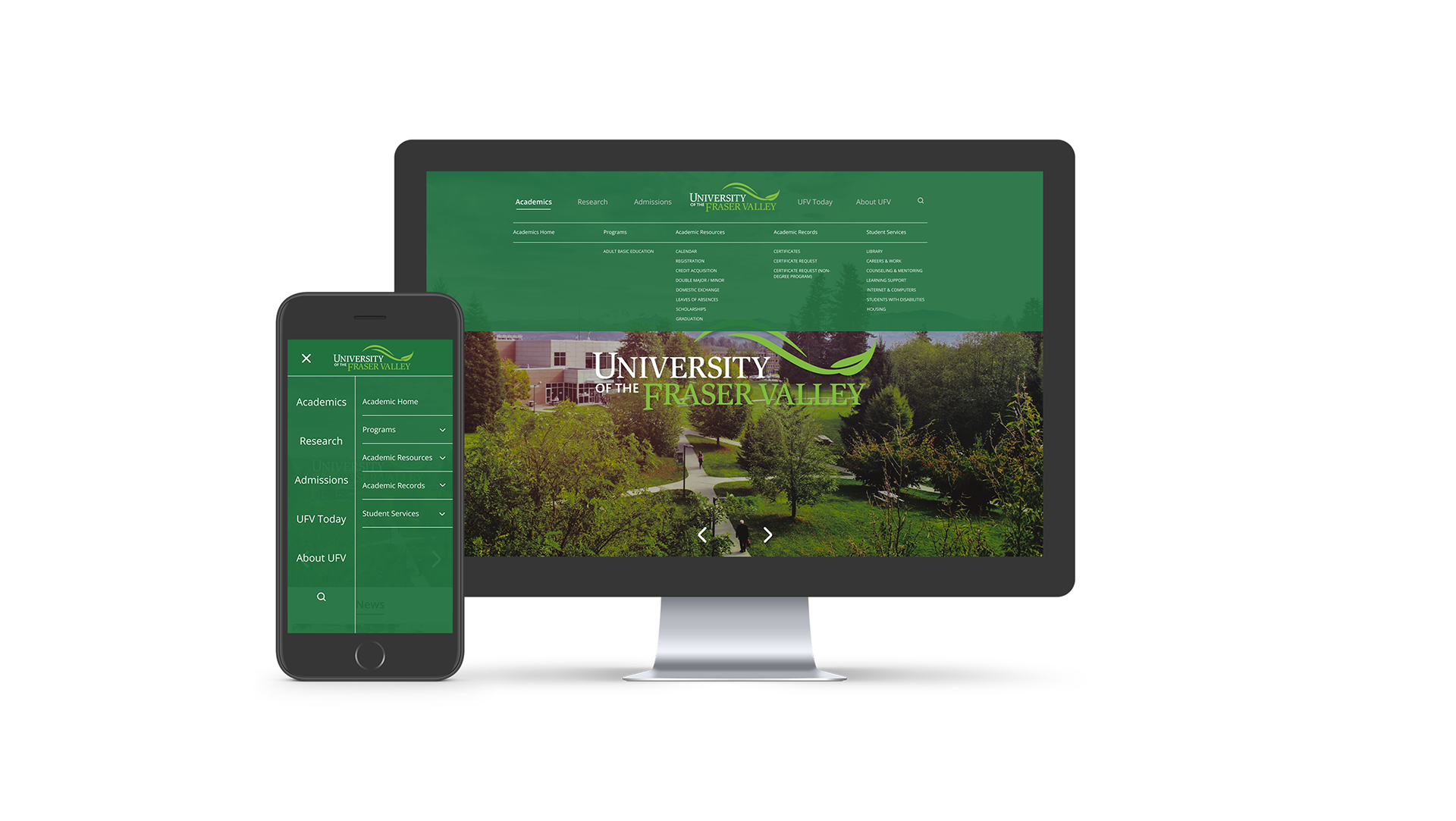
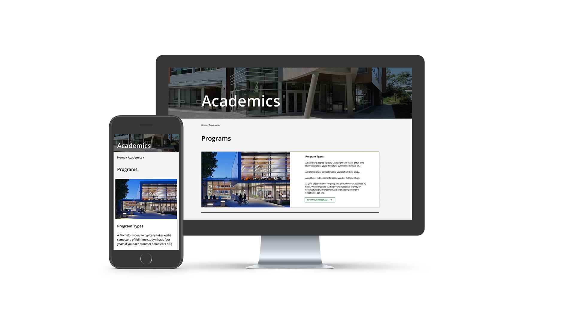
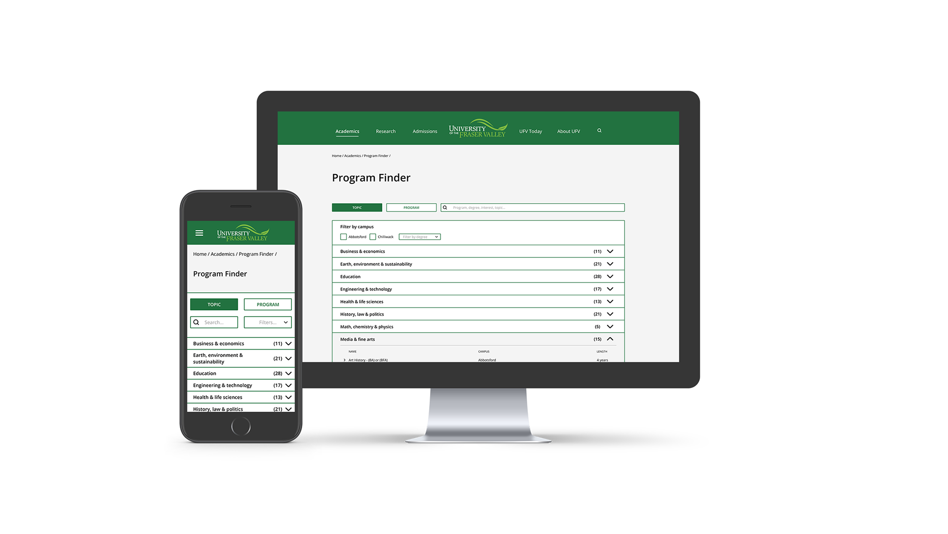
Initial designs were rough and lacked uniformity across web and mobile platforms. After the usability studies, navigation was refined with collapsible menus for better user engagement.
High Fidelity Prototype
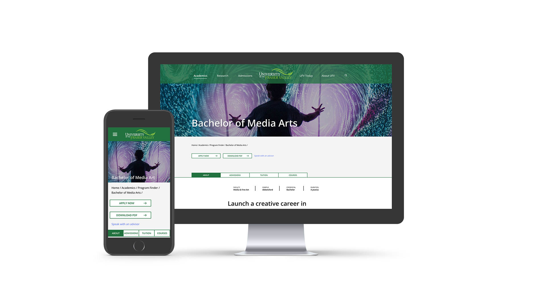
The prototype showcases responsive design, drop-down menus, and CTAs. Users easily find courses across devices, enhancing navigation.

Accessibility Considerations
1. I ensured proper colour contrast between text and background to ensure readability, particularly for users with low vision or colour blindness.
2. I choose legible fonts and suitable font sizes, considering that users with visual impairments often require larger font sizes for comfortable content reading.
3. Maintaining consistency in layout and navigation elements is crucial for helping users anticipate where to locate information. This predictability is particularly valuable for users who rely on consistent patterns for smooth navigation.
Going Forward
Takeaways
Impact: The enhancements make UFV appear sleeker and more sophisticated, aiding both domestic and international students in finding the necessary information for applying to the university. Another aspect of an enhanced IA's contribution to the website is that it showcases UFV's dedication to user experience and professionalism, impacting students' perception of the institution in a lasting manner.
What I learned: I gained valuable insights into the diverse perspectives people have on a common product. It's humbling to realize that what may seem clear to me might lead others to approach tasks in unexpected ways. Embracing these varied viewpoints helps in designing with greater inclusivity.
Let’s connect!
Thanks for taking a look at my work on the University of the Fraser Valley website! If you're interested in seeing more or getting in touch, please feel free to reach out to me on either of these platforms.
Email: ajcoulterdesigns@gmail.com
Linkedin: www.linkedin.com/in/ajcoulter
