Introduction
The Product
Shake Shack is a globally recognized fast-food chain restaurant known for its commitment to delivering fast, delicious, and fresh burgers, shakes, and sides. The restaurant maintains competitive pricing in order to attract a diverse range of customers, including students and nearby office workers seeking convenient and affordable meal options.
The Problem
Users reported a sluggish and cumbersome ordering experience and sought a solution for table-side food ordering and scheduled pickups.
The Goal
A mobile site layout revamp and the introduction of table-side food ordering and scheduled pickups for enhanced user experience and convenience.
My Role
UI / UX Designer from conception to delivery
Responsibilities
Conducting interviews, creating paper and digital wireframes, prototyping at both low and high fidelity, conducting usability studies, accounting for accessibility considerations, sourcing images & creating copy and iconography, and continuously iterating on designs.
Understanding the user
Summary
Through conducting interviews and developing empathy maps, I gained insights into the needs of the users I'm designing for. A primary user group identified through research was both employed individuals seeking quick and satisfying meals during lunch breaks or after work, as well as students looking for convenient and affordable options.
This user group loved the convenience of using the mobile website for Shake Shack, as it eliminated the need to download an additional app. Users also wanted to be able to schedule orders ahead of time and order from their table because the restaurant gets crowded quickly.
Pain Points:
Planning Ahead - No way for users to plan their pickup time to avoid waiting with people who haven't yet ordered.
Lack of seating - No way for solo users to claim a table without having to leave to grab their food.
IA - Website does not scale well for mobile users and creates a poor experience.
Personas
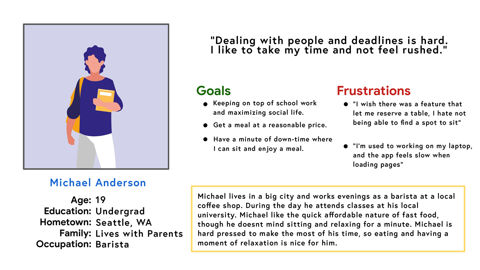
Problem Statement
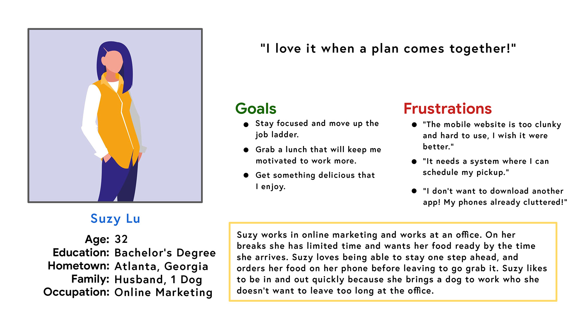
Suzy is a busy office worker who needs an easy way to navigate the mobile website, and a way to schedule her pickups because she has a limited lunch break and doesn't want to spend time sitting in line.
User Journey
Mapping Suzy's user journey revealed how helpful it would be for users to have access to an order scheduling feature.
Starting the design
Paper wireframes
Through multiple paper wireframe iterations, I ensured that the digital wireframes addressed user pain points effectively. The new screens prioritize a quick and easy ordering process, saving users time.
Digital wireframes
Throughout the initial design phase, I remained diligent in incorporating user feedback and research findings into the screen designs.
The initial wireframes were thoughtfully designed with a strong focus on accessibility, ensuring compatibility with screen reader capabilities, a seamless user interface, and the inclusion of pickup scheduling.
Low-fidelity prototype
The low-fidelity prototype connected the primary user flow of scheduling and ordering a meal, so the prototype could be used in a usability study with the users.
Usability study: findings
I conducted two usability studies, with the findings from the first study guiding the transition from wireframes to mockups. The second study, using a high-fidelity prototype, identified areas in the mockups that needed refinement.
Round 1 findings
1. Users found the QR code scanner button was unclear.
2. Users didn’t find a purpose for the location map on the home screen.
3. Users wanted more details on the receipt page.
Round 2 findings
1. Users found the scan button too small.
2. Users tried to interact with non-interactable text.
3. Elements were inconsistent size and shape.
Refining the design
Mockups
Early designs allowed for some customization, but after the usability studies, I simplified and tidied the options on the review page. Iconography and standardized elements were also added to increase cohesion with the rest of the app.
Usability studies revealed frustration with the QR button size. To fix this issue, the search bar and the navigation tabs had to be reworked as well. I also refined the location list.
High-fidelity prototype
The final high-fidelity prototype succeeded in the implementation of the new ordering and scheduling features. It also met user needs for a cleaner more concise mobile website layout.
Accessibility considerations
1. Used a high contrast colour palette for easier viewing for users or all ages in any environment.
2. Used icons to help make navigation easier.
3. Used detailed imagery for menu items to help all users better understand the designs.
Let’s connect!
Thanks for taking a look at my work on the Shake Shack mobile website! If you're interested in seeing more or getting in touch, please feel free to reach out to me on either of these platforms.
Email: ajcoulterdesigns@gmail.com
Linkedin: www.linkedin.com/in/ajcoulter
Thank you!

